
Most viewed logos – Page 519
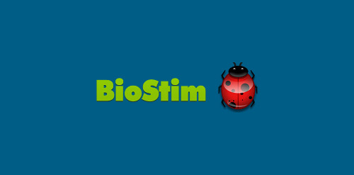
BioStim's goal is to bring a fresh approach to sustainable agriculture and human health. We have worked in the Department of Primary Industries Queensland (D.P.I) and C.S.I.R.O on world leading sustainable agriculture projects. The BioStim team have been working in sustainable and biological agriculture since 1996. Since then we have grown to be world leaders in the field and have exported to over 30 countries around the world. We have a strong education focus but have also a range of innovative products to help solve world agriculture problems. With this fresh approach we hope to bring quality, science and honesty so we all can build a sustainable future.


Corporate Design for an art and design gallery that was open 2 hours a day, for 24 days.
classic
Moonlight Brunch is a new film & television production New York City company that would like a logo with a light source - preferably not a moon, but the light the moon would be shedding. Creative brief: no moon, no film cans, film sprockets, film cameras. No diner or diner food. :)
logo for herbal company
logo fofr Stopp- motocycle brake discs to motorcycle dealers and motorcycle riders seller

logo for company drums.lt
This is the logo of Arte In Vetrina, italian art website (www.arteinvetrina.it) The logo is composed by the letters A I and V, short name of the website (AiV= Arte In Vetrina)
Logo fast help
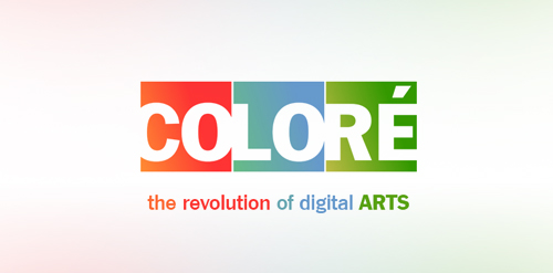
Colore is a professional digital arts company and Colore is a French word that means colorful in English so that's why i made so colorful!
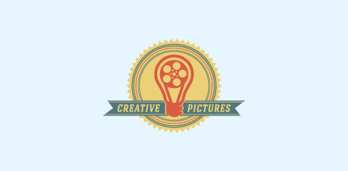
another concept - a bulb with film spool inside as a retro badge.
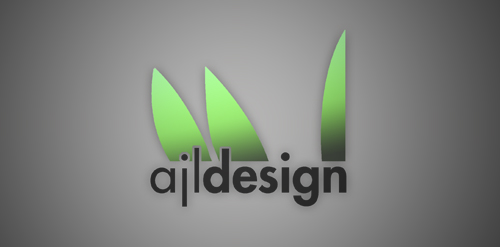
I needed to create a logo for myself for a web design class. My idea was to use my signature, but to only use my initials. Realizing this was to literal i kept removing parts until all that was left were the leaves that sprout from my name. The green represents my growth as a designer and i choose Futura because of its unique lowercase j. Hope you guys like it.
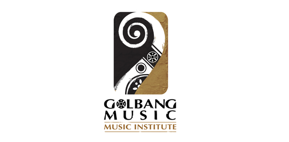
music institute
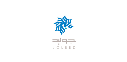
Personal Logo For Mr.Joleed
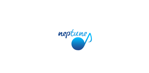
The essence of the logo is the "union" of the planet "neptune" with the word "tune", suggested both in the typo-graphic and symbol.
This is a logo that I designed for a university corporate identity project. The name of the business is "Paradise Heavens" and it is a lounge/bar/restaurant targeted to be located in shopping malls - intended to be a place to sit back and relax.
PRINTWILL
Katakali is a lifestyle store in Marrakech retailing books and international lifestyle products. The logotype was inspired by the brand-story which revolves around the mystical lore of an explorer in the orient. The hints of calligraphy which are more intuitive than specific were used to give it a lyrical feel. With tsk Design.
Designed by www.logodesigncreation.com