Highest rated logos
Highest rated logos – Page 223

The logo is an emblem of my three distinct cultural identities as a graphic designer: the head of a Chinese dragon, the body of an English lion and the tail of a Portuguese rooster. Born in a Portuguese colony in China where east meets west, I grew up in a richly diverse cultural background and have now lived in the English capital for more than ten years.


A creatively simple logo.

This is a logo for Star Zone Company Limited.

Logo for a gothic art thyme showroom...tee, rings, posters.
I made this while doing a personal project for a fake company called SquidSearch. It was for practice and to develop my skills in logo design. I also designed this squid so there was a hidden search icon. This logo is for sale.

Logo for a project University Project.

Beauty company. Kelebek means butterfly in turkish.
Proposal for personal protege/mentoring and accountability system.

Logo redesign for broadhead manufacturer.
Flamingo Logo for club night! Feedback and support appreciated! // // // Instagram/Twitter @Franperezdesign

Scott Sanford is a fitness coach and instructor. With this logo a went with a modern but slightly gritty approach. He fell in love with this concept.
Software and Servers

Homage of the famous Berlin bear.

Logo for an audio software company

Lettering for store.

Exclusive Customizable Logo at http://wp.me/s4571j-tombro

logo for social network

Version no. 1 of logo for Spatial Development Planners Association of Western Poland. In logo is shown simlified Poland's borders shaped in a cube (which symbolize space) in a same time.

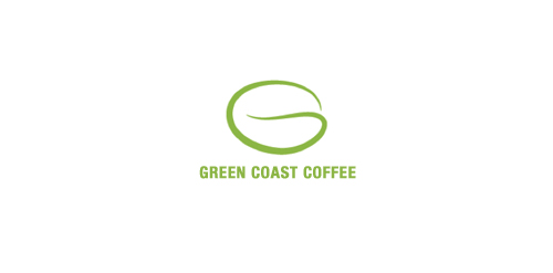
A coffee company - Green Coast Coffee - which locate in China. Simple: using a letter of "G" to be the main concept and let the coffee bean behind.