Highest rated logos
Highest rated logos – Page 222

Private psychotherapy practice providing individual, couples, and family therapy.


Евразия Логистик. Logo for Russian company specializing in wholesale and retail trade in rolled metal, plastic products, provision of transport services. Symbol built from the first letters in the form of stacked pipes.

logo concept for a creative agency
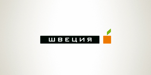
Designer: Denis Aristov Client: Sweden Group Industry: Advertising Agency Keywords: advertising agency, square, cube, apple, orange, green

Exclusive Customizable Logo at http://wp.me/p4571j-5J
Library Logo

Logo for film and video production. We played with the name "De León" (Spanish) "of lion" in English

A common platform for photographers,models,fashion designers,make up artists and Photo lovers. Also an eCommerce portal for photography accessories.
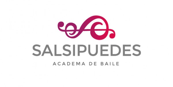
La marca fué diseñada para un proyecto de Academia de Baile. Actualmente no está en uso pero se encuentra registrada para algún futuro emprendedor.

This logo is from my design archives and it's for sale. The name used is just for reference.


Computerology are a Dublin Based IT services consultancy, providing Irish enterprises with reliable and efficient technical support.
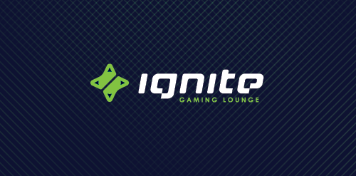
ignite is a Chicago located place where you can hang out playing in your favorite video games, enjoying a good coffee, beer, make new friendships or just having a good time with old good pals. Main objective was to obtain a mark which in clear and simple way communicate the nature of the place which represents + design custom typography to show an uniqueness of this place. We decided that the best solution would be a combination of two game controllers (symbol of game community) in the shape of the d-pad which also refers to the form of sparks, which is a direct reference to the IGNITE name. Full ID http://bit.ly/XkAZ43

Concept identity for non-existent company. I made it just for fun. One day I came up with the idea of this logo, so I decided to make it. Hope you like it.

dancing petal design

Platinum Flooring / Floor design service.
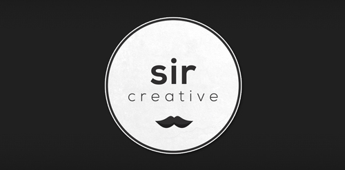
Logo design created for Sir Creative, my online freelance portfolio identity. Visit me at: www.sircreative.com
Email me: art@sircreative.com

Footwear manufacturer Sweden

Premium gourmet stove specialist, Labrieyre brings a contemporary knowledge to French tradition. The brand is a newcomer in a highly competed market, but whith a unique positioning on tradition, performance, style and design. Brand Brothers accompanied Labrieyre in brand design, brand identity, graphic, print and web branding, signage and through the identity of the future company stores.

Emblem for a quality coffee dealer and cafe shop.

human muffin http://losefatfrom.com/img/backfat.jpg
Logo for Quinno.
The Radford’s are the largest family in the UK and Hotfoot worked with them on their original website www.theradfordfamily.co.uk, as well as design and developing their brand new eCommerce website which was launched in 2015. The website was recently shown on the Channel 4 documentary 18 Kids and Counting. Charlie Haywood, Hotfoot Design’s Creative Director, said, “We were approached by Noel and the family to create an eCommerce site that would convey their commitment to good, wholesome food made from ingredients from local suppliers. As ordering a pie online is still quite novel, it was important that we designed a brilliant user experience that gave people the confidence their tasty pies would be delivered with extra care. After ordering one myself the other day, which arrived in a temperature controlled box, and which was, frankly, outrageously delicious, I am sure there will be many repeat customers!”