
Featured logos
Featured logos – Page 23
Its been it been a while that didn't update any Clever Wordmark, thought of comeback with this Arrow logotype today, hope i will find more time for this day to day activity in future


Jankeš beekeeping- logo. J=bee.
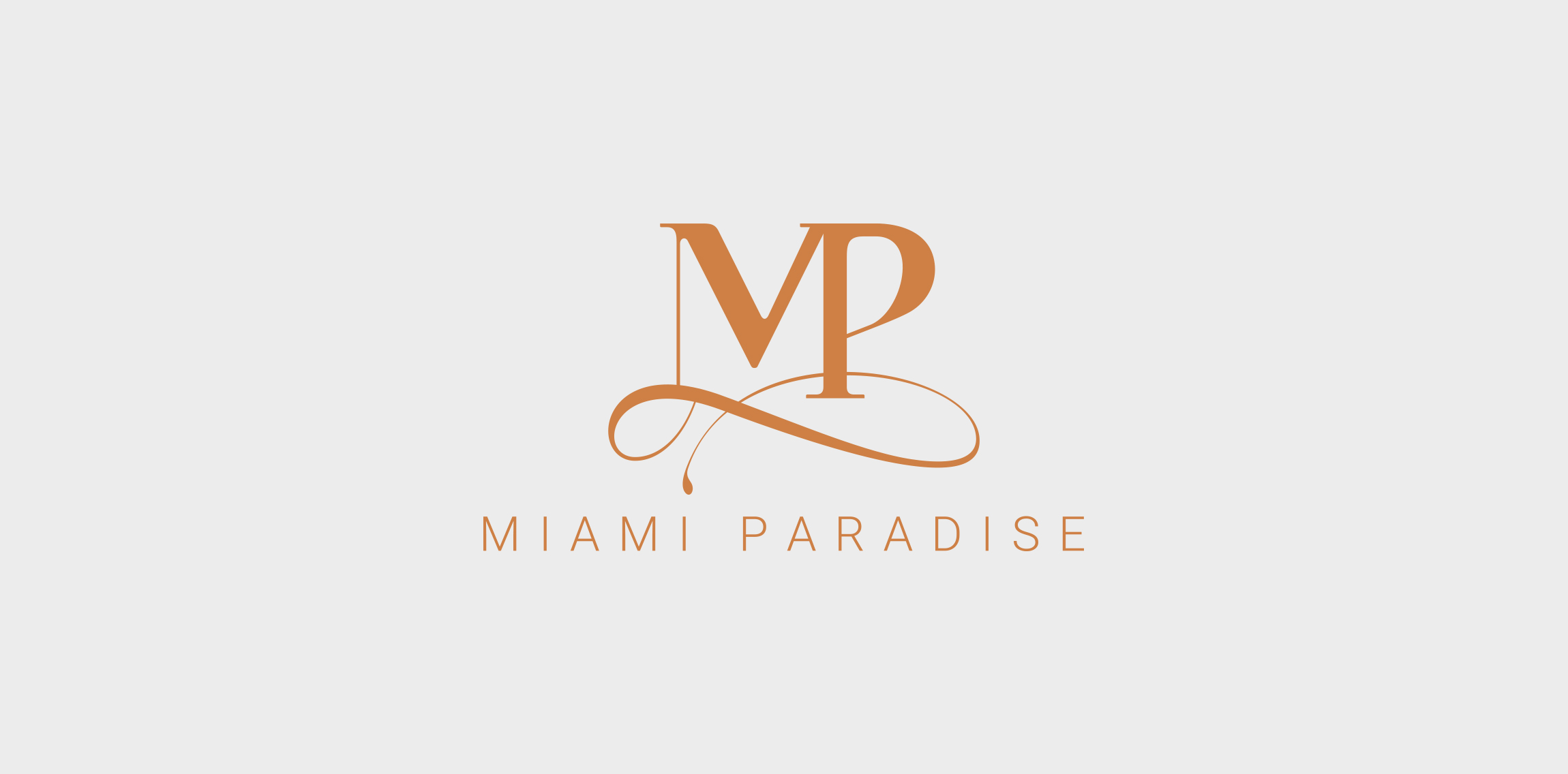
Logo for Miami Paradise a company specialized in Miami and Miami Beach Luxury Real Estate
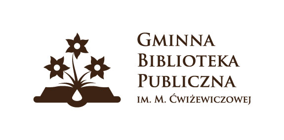
Gminna Biblioteka Publiczna im. M. Ćwiżewiczowej is a library established in 1929. It is located in Podhale, south Poland, region well known for its vivid folklore and deep respect for culture. The most common ornament embroidered on traditional clothing is the flower of carlina, which was the main inspiration for this design.
The idea for the logo came from an old saying:
"A book is like a garden carried in the pocket".
Parrot multicolor
I,m preparing logo for my website and i'm searching for a perfect one ;) I appreciate any advice and opinion
the logo represents a cat and a dog, in negative space

Logo to a business system company.
logotype for natural, homemade soaps
Another monogram for Adrianne Keishing.
New brand for all type of glasses to see more please visit https://www.behance.net/gallery/14980147/GLASSES-IDENTITY
Mail Service
Logo for a humorous wedding photographer. Monkeys are a part of the name of the logo.

For purchasing contact me.
Logo Concept: Home + Hang Tag + Tree.
Event production company from Miami
Bird logo design with golden ratio grids. You can buy this logo. Just send me a message or see more on website: www.dainogo.net Grids and animal logos | 02: https://www.behance.net/gallery/52457649/Grids-and-Animal-Logos-02
The symbol representing a crown, refers to something noble, reflecting the quality of the work, as well as referring to the crown of Santa Maria, since the main public served is the Catholic church.
The Russell Patterson logo creates the "RP" logo using negative space. Its color palette is also reverse of what's expected—instead of dark symbols on a white backdrop, it uses white on a dark backdrop.
art = therapy
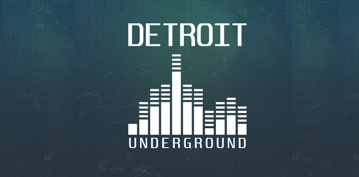
The Detroit Underground logo utilizes a flat minimal design, also featuring a graphic that resembles a skyline and a volume equalizer.
I decided to challenge myself to create logotypes everyday with random words.
SYNC Media logo
Unused idea for a business Consultants company