
Featured logos
Featured logos – Page 16
Bialy Kruk Rec is an independent recording label out of Warsaw, Poland specializing in underground electronic music.


Mobile Convert is a young team specializing in creation of audio and video content distribution systems on the Internet, develop technical content, mobile applications, games, websites and content management systems. - - - - Logotype has a simple, readable form resulting from the simplification of the M letter and incorporated in it a universal symbol of "Play" clearly referring to the audio-visual character of the company. - - - Live on www.mobileconvert.pl - - Full ID here http://on.be.net/1HbaOBD - Follow us on www.fb.me/triptic.design
Cartoon logo design. It means "Be like a God". This logo is ideal for fitness portal. And it is for sale (kacper@x-mind.pl).
One of my logos that I made for fun.
Fitness club "Fankas" rebranding
Based in Albany, NY & Washington DC, Solomon Law Firm represents federal employees.
logo for a small architectural firm based in mexico.
this logo is unused and for sell made by me..
Logo for mining industry located in Manitoba city (visualized with the map of Manitoba)
HELMET + FINGERPRINT + LETTER 'S'. Inspired by amazing Davide Fisciano. For sale.
Negative space logo forming 4 letters. C, S, G and 7.

A logo for linen service.
A rebrand of logo for a local vintage/hi-end furniture producer. The logo contains symbolic od "saw/teeth" and looks a bit luxurious also if you imagine the logo on the actual products. Which makes the brand and it´s product very special and original.
Crimson Kings eSports Logo.
I'd like to show you logo which I done for local clothes store. Main idea was to connect two symbols button and ladybug, that was client requirements.
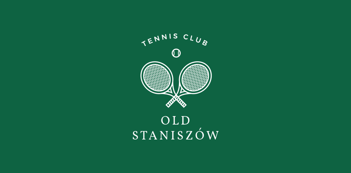
New logo for tennis club
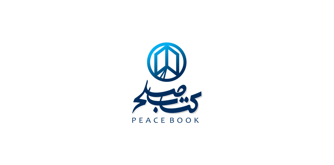
Book store
Just vectorized sketch from my sketchbook :) more at: https://www.behance.net/gallery/33949050/Logos-pack04
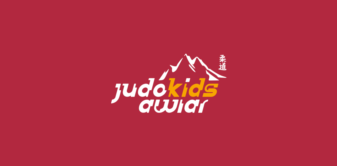
A Judo Sports Club in Austria/ Vienna For Basic Judo Trainers. "Awiar" is the name of a mountain
I decided to challenge myself to create logotypes everyday with random words.
Creative Bird Social Media Campo Grande, Brazil
.
Brand Amy Maia Alta Costura Patos de Minas, Brazil
Bridge +car dashboard