
Logo inspiration
Inspirational logos


Logo concept for a glassware company.
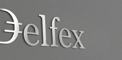
Logo and corporate identity for company trading with foreign currency. I was working on this project last two month. I made for client whole identity set from logo design, stationery design, web design with programming part, copy-writing including slogan and finally design manual. Logo on this photo is mounted in headquarters office on a wall. It was carved out of brushed aluminum plate to gain metallic look which is symbolic interpretation of currency, money and prosperity. Metallic effect literally connects whole identity. All stationery is printed by PANTONE 811 C metallic silver color. For selected materials such as business cards, compliment cards, envelopes and documents folder was used special silver metallic paper.

Four CANNABIS leafs forming as a medical plus sign . Each leafs can be considered as arrows . These arrows coming from four side and forming as a plus sign , which means we are delivering CANNABIS leafs for medical purpose only :)
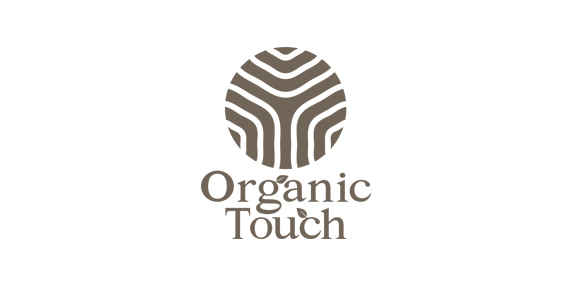
Inspired by organic products.
Restaurant
separately from logotype Alice is sign for this girl
A logo for a website for games..
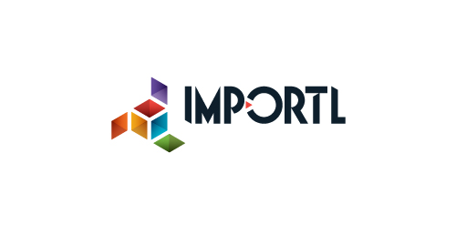
This is a logo for a completely fictitious entity named IMPORTL, which could be an open source web development site, or some type of developer software.
The idea is that the triangular facets form a series of open holes, or "portals," in multidimensional space. The central facets can also be seen to form a cube which is open on three sides. Lying before each opening is another opening on that side's respective "floor," yet, in an Escher-like paradox, where spatial orientation is an irrelevant construct, there is no floor. There is no up, down, left, right, back, or forth. This hyperspatial environment suggests infinite possibilities for the arrangement, manipulation, and exchange of data.
For color, the idea is that the primary colors that form the central cube beget the secondary colors that rotate outward, suggesting expansion, transformation, evolution.
The mark employs a custom typeface that compliments the angularity of the mark.
Click here to see the case study for this logo, which chronicles its development, and includes full design rationale, sketches, electronic roughs, and alternate designs.
Hairdresser Logo Proposal
...
Made a logo for fun.
Logo for online shop with clothes and accessories for kids
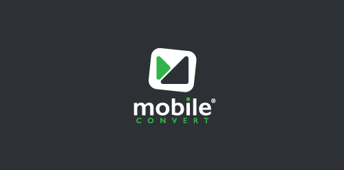
Mobile Convert is a young team specializing in creation of audio and video content distribution systems on the Internet, develop technical content, mobile applications, games, websites and content management systems. - - - - Logotype has a simple, readable form resulting from the simplification of the M letter and incorporated in it a universal symbol of "Play" clearly referring to the audio-visual character of the company. - - - Live on www.mobileconvert.pl - - Full ID here http://on.be.net/1HbaOBD - Follow us on www.fb.me/triptic.design
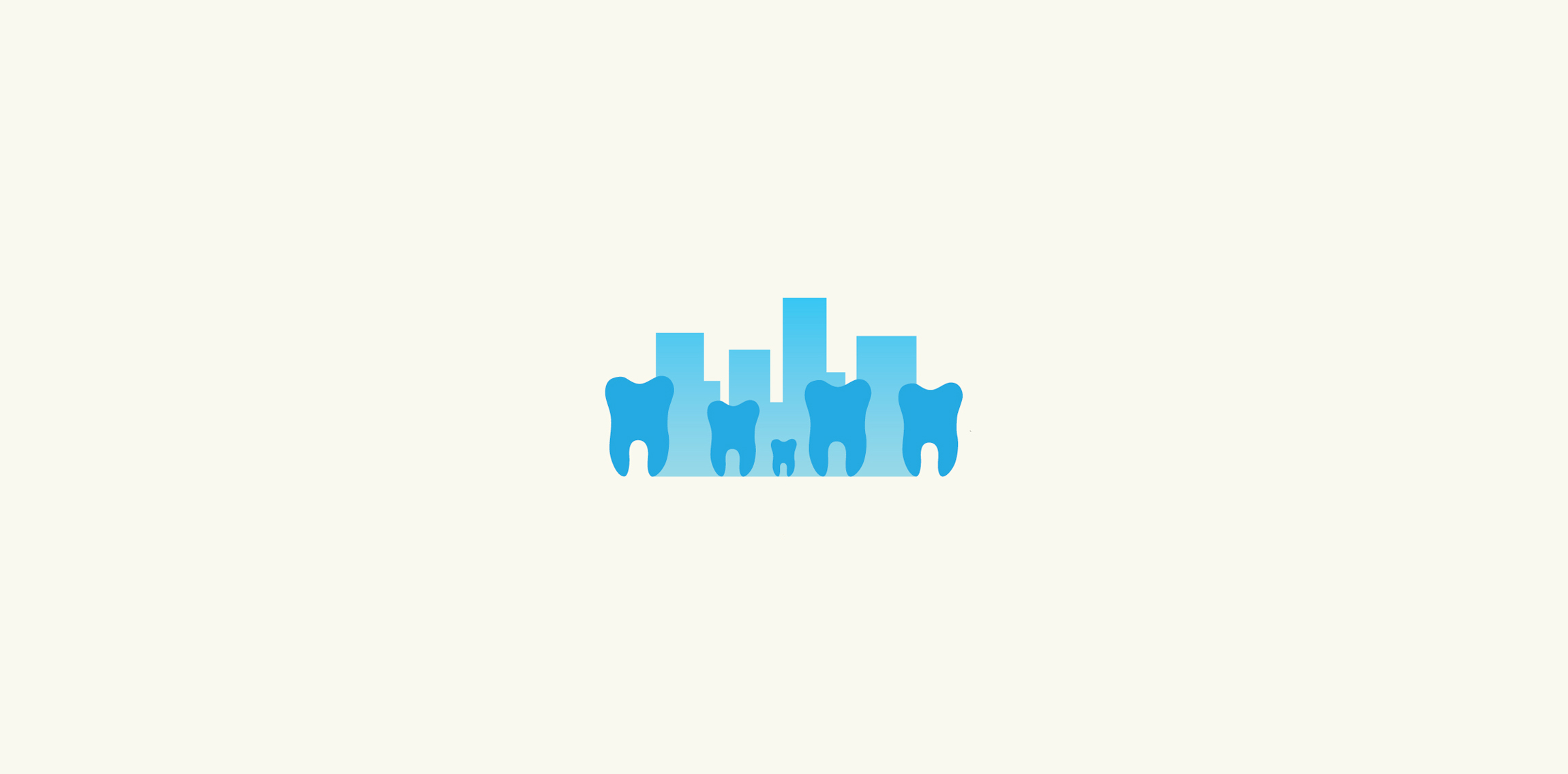
ReadyMade logo sold for a dental discount program named Premiere at http://wp.me/s4571j-premier
PortEight Production
Playing around with some new style
☆ HONORS ☆

-
shtef-sokolovich
190 logos
-
Boldflower Design Studio
189 logos
-
Ailton Marques
115 logos
-
Light Rainer
114 logos
-
Alek • Triptic.pl
107 logos
-
almosh82
96 logos
-
sadany
96 logos
-
Duminda Perera
93 logos
-
pizelato™
91 logos
-
Aleksandar
91 logos

Recent comments
حسین:
please send me...
chirag_j:
Hello is the above issue resolved?...
mrgraphics:
great logo...
Aleksandar:
Thank you Gile!...
fraGile:
Thanks a lot!...
Marko Bulatovic:
Great work!...
Popular tags
Our logo inspiration gallery will give you the creative boost you're looking for. Get your daily dose of logo design inspiration to work on your own logo design projects and get your business going. Be amazed by our logo designers and their brand guidelines. We are here to help you impress your clients and our fellow designers. Professionalize your logo design skills and get yourself to a new level. Browse our logo design gallery and discover all the new logo design trends and much more. We know you love logos!